 To download, click
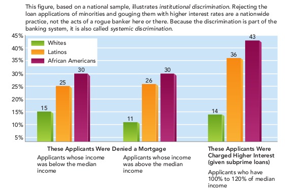
Making This Image AccessibleThis image can be made accessible with image descriptions or by creating a tactile graphic that would support different learning styles and braille readers. The choice of modality varies depending on factors such as the information to be conveyed, grade level, student knowledge and experience, and the image itself. In this example, it is necessary to provide both a short description and a long description. Since there are several equally effective ways to describe the image, we have provided two short descriptions and two long descriptions. How an image description is displayed depends on the reading tool being used. In most mainstream reading tools, the description will not be displayed at all, but in tools designed for accessibility (or mainstream tools with accessible features enabled), the description could be displayed below the image, voiced as part of the content, or both. This is an example of an image in which text is embedded in the image and is not accessible. The content needs to be extracted from the image and included in the description. |